Rosmarie Tissi
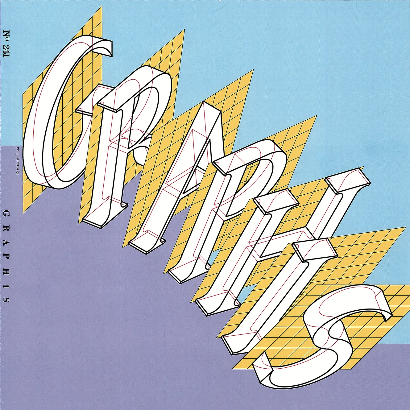
Cover for „Graphis 241“ ( Contained an article on Odermatt & Tissi), 1985. © Rosmarie Tissi, Zurich.
In 1937, Rosmarie Tissiee began her lifelong career as a Graphic Designer at the Zürich school of Art in Switzerland. Her work is most popularly known for her bold posters, typography, and use of bright eye-catching colors. The personality that she was able to spin within her graphic work has earned herself a unique position among many Swiss Design artists of her time. She never really made the work about herself but, rather, delivered exactly what a client needed in order to get the most eyes on a particular project as possible. She was able to publish for the first time in 1957 in Neue Grafik magazine and then a year later came out with an exhibition with her mentor Siegfried Odermatt. Together the two artists pushed the refreshing, new narrative for Swiss Design and became extremely dedicated to contributing to their movement for the rest of their lives.
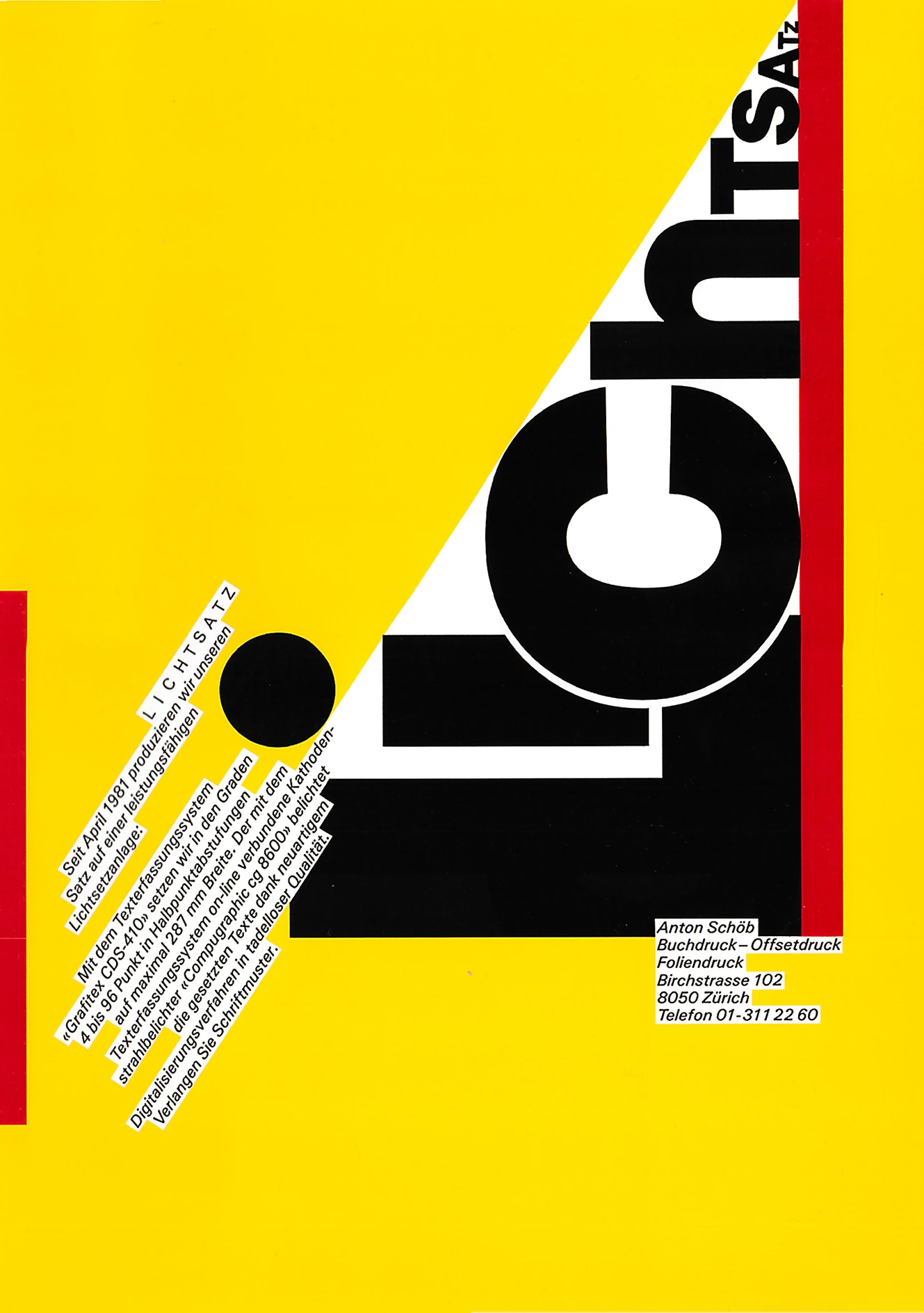
Cover of a folder „Lichtsatz“, 1982. © Rosmarie Tissi, Zurich.
I think that one of the most impressive commissions throughout her lifetime would be that of her work with the Swiss Bank Note. It’s interesting to me that a governing body would look to a graphic designer for abstract, geometrical bill designs. It’s rare that an artist of such historical magnitude can make such a political impact on one’s culture of regional design. A stunning poster she designed for The World Cup Expo in Tokyo 1996 was another contributor to her long line of successful, impactful works. In 2018 she received the Swiss Grand Award for Design as an indicator for her large strides for all artists learning in Rosemarie’s footsteps. As a notorious female artist, she is a pillar for women all around the world with rich inspiration and encouragement that hard work and confidence can really pay off in the end as an artist. In her later life she began lecturing and teaching art in multiple universities throughout Europe and the rest of the world. She has posters in various languages and was known to never say no to an interesting project.
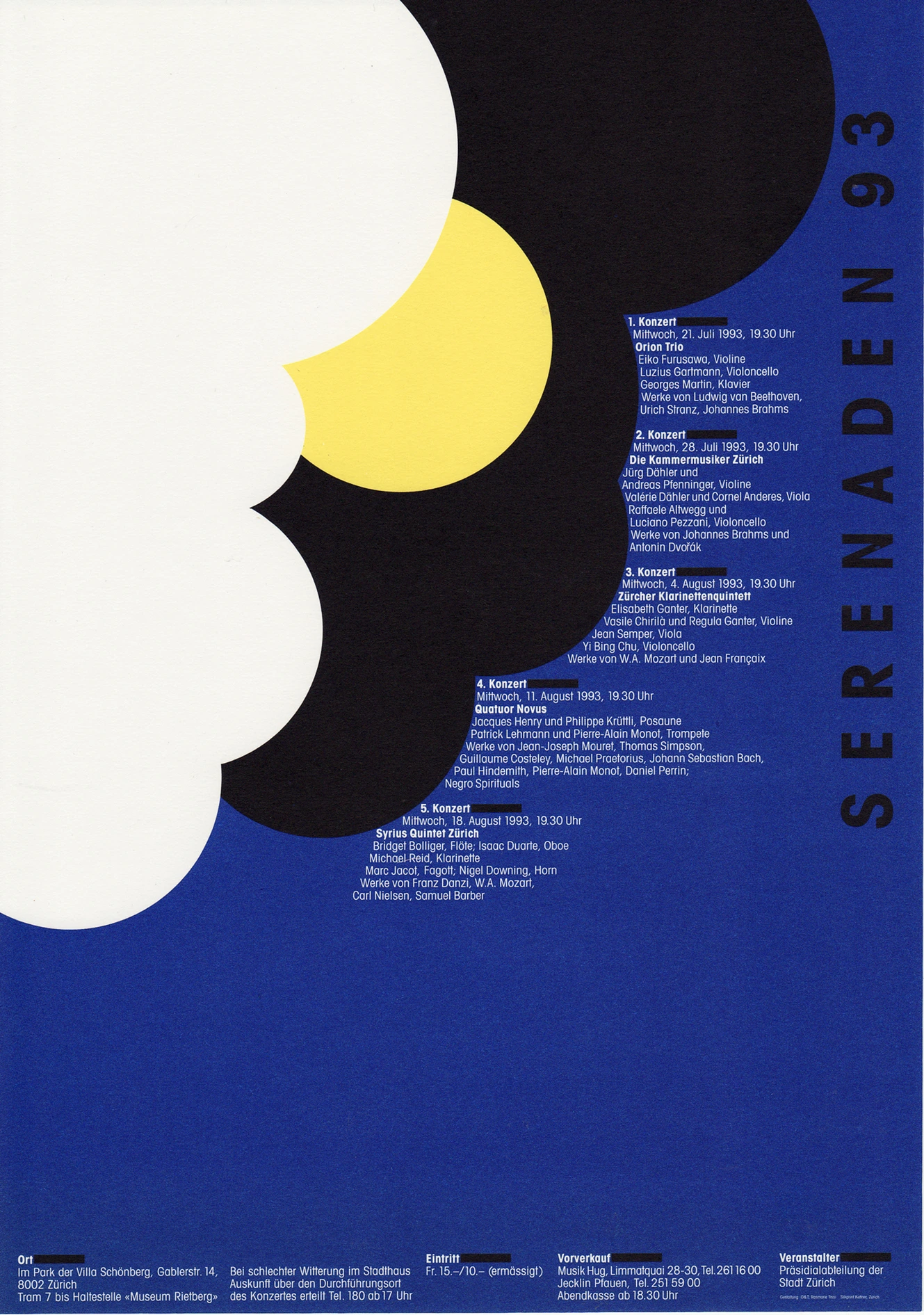
Poster for „Serenaden 93“. © Rosmarie Tissi, Zurich.
Folding bright colored papers into one another, playing with type and pushing the visual concept of a letter, and- mostly- playing with negative space, proportion, and composition is trademark for Rosmarie’s poster designs. Her clean line work and thick, bold confidence regarding her messaging is straight-forward and attention grabbing. The legacy she leaves behind is full of her shared knowledge and beautiful artwork. Brands, Logos, and all her commissioners bear the prize of her contemporary, unique creativity and grace. It was all thanks to her guide rules that she set for herself when designing that her clean consistency was able to shine through. She only focused on what was essential and by limiting those distractions she was able to create seamless, sharp work that spoke beyond its simple shapes and flat surface.Still alive today, she is almost 90 years old and has lived a long fruitful life of artistry thanks to her successes. Her genderless rejection of female stereotyping launched her decades before her time as societal critics lay miles within the dust.
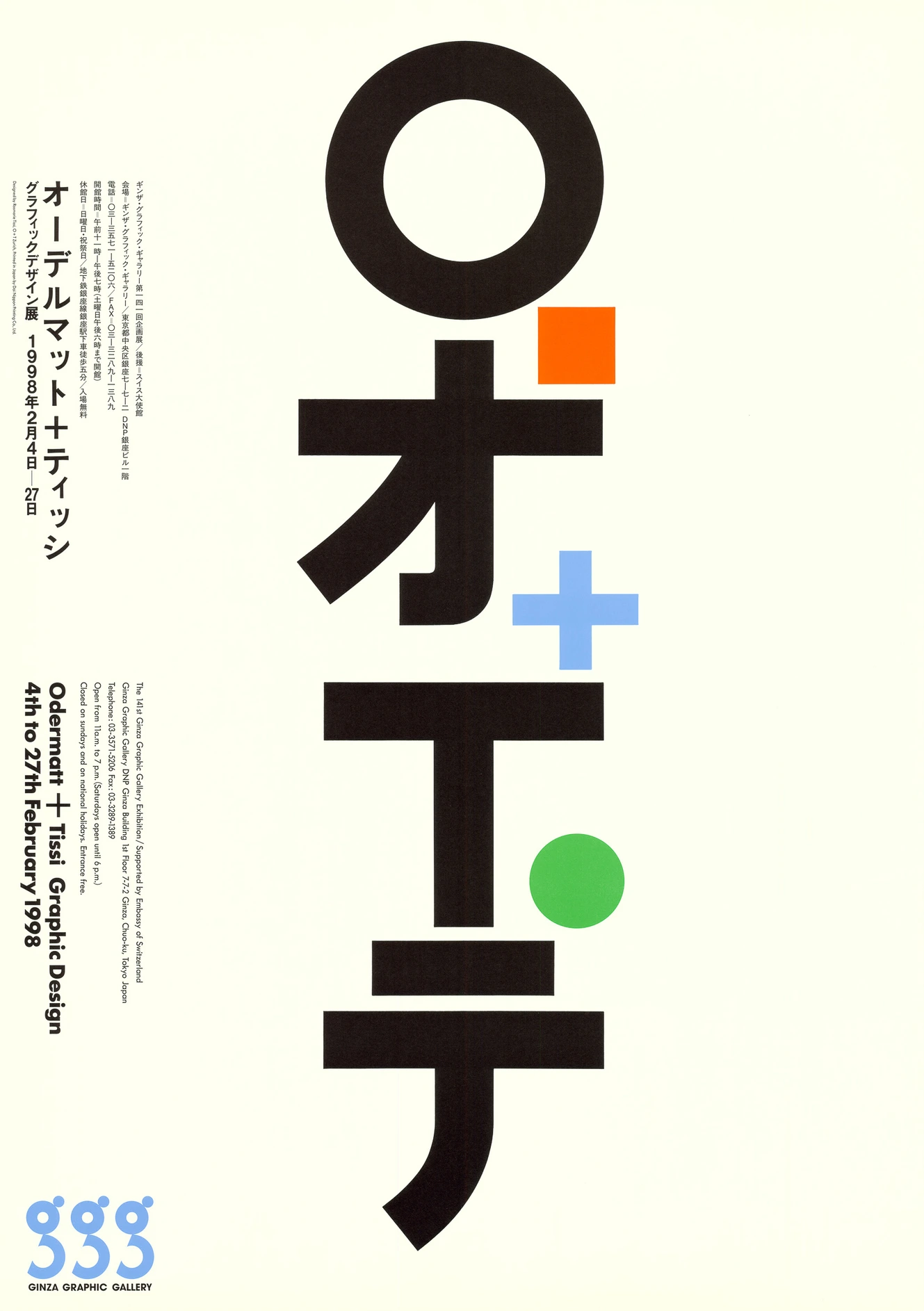
Exhibition poster O&T at the Ginza Graphic Gallery in Tokyo, 1998. © Rosmarie Tissi, Zurich.
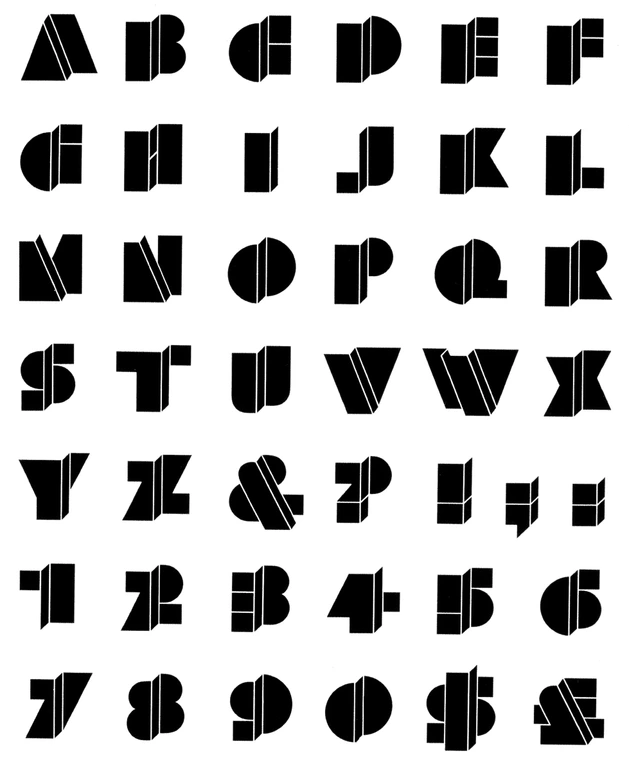
Alphabet „Mindanao“. 1975. © Rosmarie Tissi, Zurich.
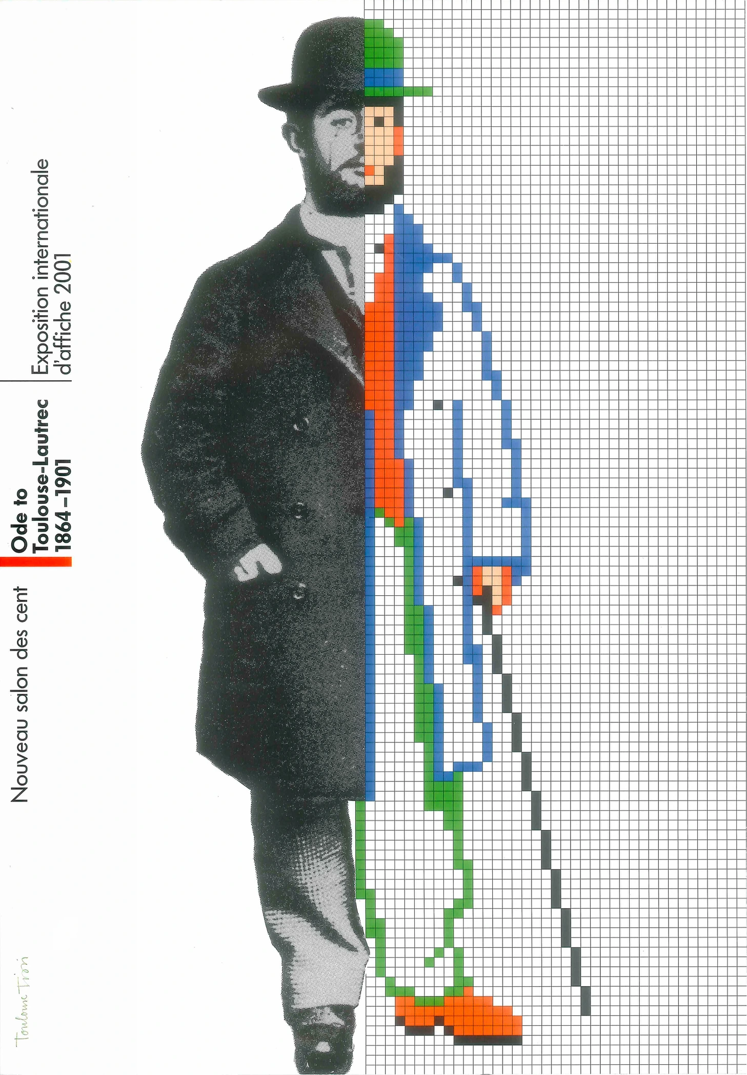
Poster „Ode to Toulouse-Lautrec, 1864–1901“, 2001. © Rosmarie Tissi/Henri de Toulouse-Lautrec (FR, 1864—1901).
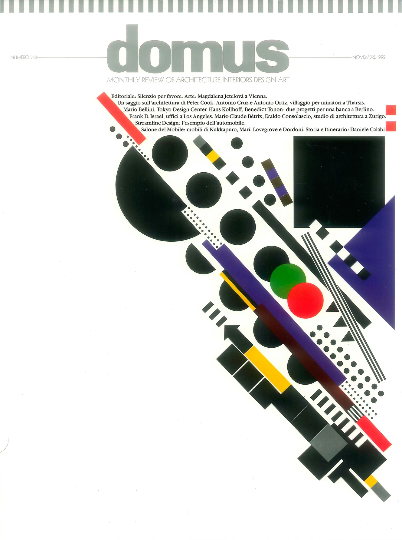
Cover for Domus, an Italian magazine on architecture, interiors and design, 1992.© Rosmarie Tissi, Zurich.
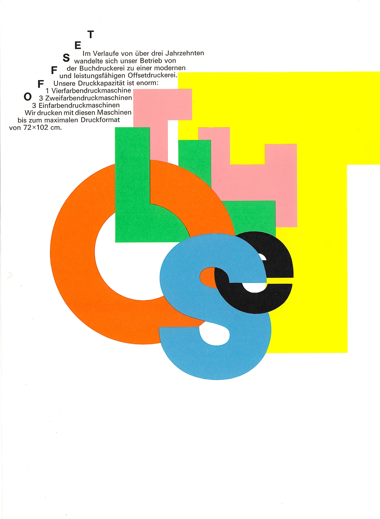
Back of the folder Fotosatz „Offset“, 1981. © Rosmarie Tissi, Zurich.
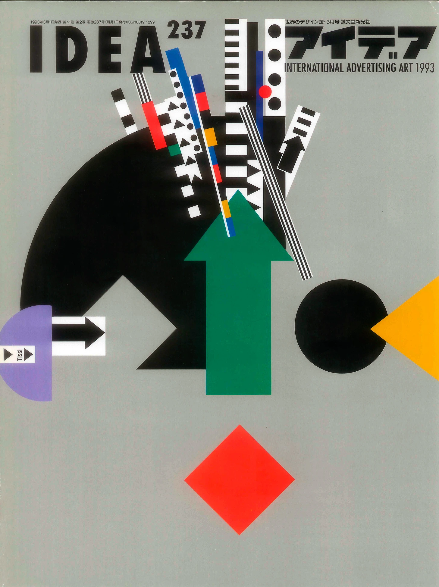
Cover for Japanese design journal „IDEA“, 1992. © Rosmarie Tissi, Zurich.
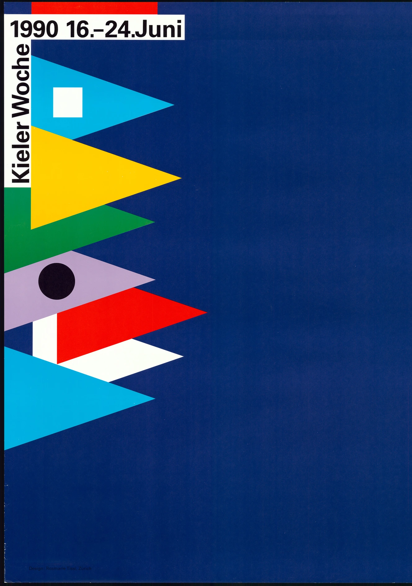
Poster for "Kieler Woche 1990“, 1980. © Rosmarie Tissi, Zurich.